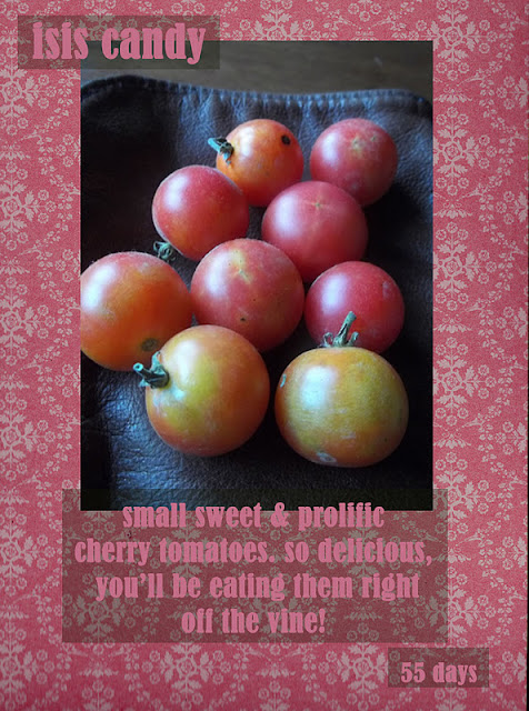
above is the original. made how is used to do it, cut & paste printed little lines of print. i like the old skool look of it, but it is started to get a little worn over time . . . so, i made up some new options this aft . . . hmm. think i need to darken the font on the 2nd


No comments:
Post a Comment